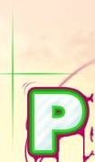
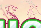
Adım 16 For this step you will need to have a floral brush set, lots of these can be found
here , download one and install it, note that you may need to restart Photoshop after installing it.
Bir çiçek fırçası ayarlanmış olması gerekir, bu adım için, bu buraya indirmek bir ve
yüklemek bulabilirsiniz çok, bu onu yükledikten sonra Photoshop yeniden başlatmanız gerekebileceğini unutmayın.
Create a new group behind the text and in a new layer; use the purple swatch and go wild with these brushes, making them flow from the letters and the lines.
Metin ve yeni bir katman olarak arkasında yeni bir grup oluşturun; mor Swatch kullanımı ve vahşi bu fırçaların birlikte, harfleri ve satırları onların akışını sağlamak.
My set included some leaves which I dotted around using the green swatch.
Benim ayarlamak ben yeşil Swatch kullanarak civarında olan noktalı bazı yaprakları dahil.
Using the floral brushes was just an idea, other vector style brushes can give good results too, one which is worth trying is using tree brushes on the top half of the letters.
Harfleri üst yarısında ağaç fırça kullanarak bir çiçek fırçaları kullanarak diğer vektör tarzı fırçalar da, bir olan denemeye değer iyi sonuç verebilir, sadece bir fikir oldu.
Step 17
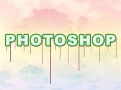
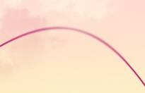
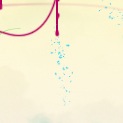
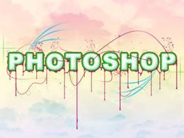
Adım 17 Another nice detail that is simple to make is these blue lines.
Bu yapmak için basit bir diğer güzel bir ayrıntı bu mavi satır.
First create a new layer then select the blue swatch then the brush tool and use an 8px hard brush.
İlk sonra yeni bir katman oluşturun sonra fırça aracı mavi Swatch seçin ve bir 8px sert fırça kullanın.
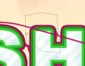
Use the pen tool to create a large arc, mine went roughly from the 'H' to the 'O', now stroke the path and make sure simulate pressure is checked.
Kalem aracını kullanarak büyük bir ark oluşturmak için, benim için 'H' kabaca yolunu ve emin olun 'O', şimdi vuruş kadar gitti denetlenir baskı simülasyonu.
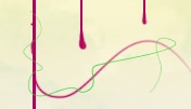
Use the eraser tool to get rid of half of the line and to blend it slightly.
Silgiyi aracını kullanın için çizgi yarısı ve kurtulmak biraz bütünleştirebilir.
I created three of these.
Üç bu oluşturduk.
Step 18
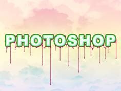
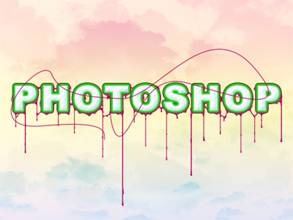
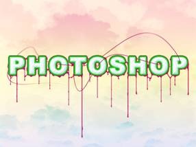
Adım 18 Duplicate this layer, with all three lines in it then hit Ctrl+T and rotate the lines roughly 180° then move them to below the text as shown here.
, Bu her üç satır sonra bu katmanı Duplicate Ctrl tuşuna + T ve yaklaşık 180 ° sonra metni aşağıda taşımak satırları dönüşümlü burada gösterilir.
Step 19
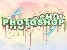
Adım 19 The text is looking nice now however the foreground and background are like to separate images at the moment so we will learn a few ways to make them harmonize better.
Metin böylece onlara daha iyi uyum sağlamak için bir kaç yoldan öğrenmek şimdi ancak ön ve arka plan ayrı görüntüleri için şu anda gibi güzel görünüyor.
A good way to approach this problem would be to create an in between layer which is kind of half and half and can bridge the gap between foreground and background.
Bu sorunu yaklaşım iyi bir yolu bir katmanı arasında olan yarı buçuk tür ve ön ve arka plan arasındaki uçurumu in oluşturmak olacaktır.
Start by creating a new group within the foreground group but below everything else in that group.
Ön grup içinde ama bu grupta her şeyin altına yeni bir grup oluşturmaya başlayın.
Create a new layer in this group then go image>apply image then edit>transform>warp and drag only the boxes here to warp the image, make sure that when your warping the image it still covers the entire document or else you will be left with sharp edges.
Bu grup daha sonra görüntü git> sonra düzenlemek resim geçerli yeni bir katman oluşturun> dönüşüm> eğrilmesine ve görüntü eğrilmesine sadece kasa burada, emin olun zaman hala tüm belge veya başka bir sol olacaktır kapsayan görüntü warping sürükleyin keskin kenarlı.
Step 20
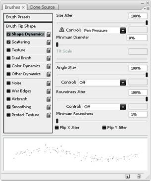
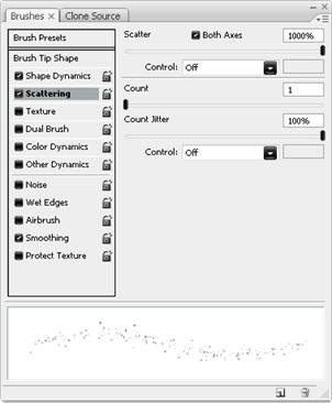
Adım 20 Now select this layer then go layer>layer mask>hide all, change the foreground color to white then use a few of the following brushes with medium opacity to unhide some of the content on this layer, make sure the layer mask is selected rather than the layer itself.
Şimdi bu katmanı seçmek katman git> katman maskesi> tüm gizlemek, beyaz, daha sonra bu katmana içeriği göstermek için bir orta donukluk ile aşağıdaki fırça az kullanmak önalan rengini değiştirmek, katman maskesi yerine seçili olduğundan emin olun katmanı kendisi.
1.
A grungy brush of any size, this can be a brush you have downloaded or one that comes with Photoshop like the spatter, charcoal or chalk brushes, these work well when used at a larges size and dotted rather than dragged.
Her boyutta bir grungy fırça, bu indirdiğiniz veya bu sıçramak, kömür veya tebeşir fırça gibi Photoshop ile birlikte gelen bir fırça gibi, bu iş iyi bir larges boyutunda kullanılır ve yerine sürüncemede daha noktalı.
2.
A floral brush of medium to large size.
Büyük boy orta bir çiçek fırçası.
This looks good on a slightly higher opacity brush as well as on low.
Bu iyi bir daha yüksek donukluk fırça yanı sıra düşük görünüyor.
Never drag these brushes, it just doesn't work.
Asla bu fırçaların sürükleyin, sadece çalışmaz.
3.
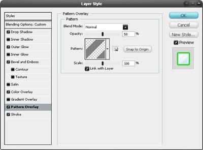
A really good effect can be created when using the pattern stamp tool (s), although it requires a few tries to get it right.
Her ne kadar gerektirir bir iyi etkisi modeli damga aracı (ler kullanarak) yaratılabilir, birkaç hakkı elde etmeye çalışır.
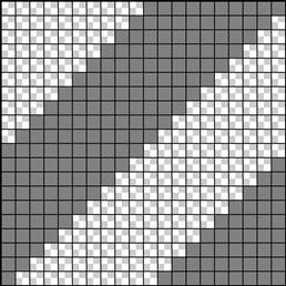
Try using the pattern we created earlier and also some of Photoshop's like the checkered one.
Daha önce de bazı oluşturduğunuz kalıbı kullanmayı deneyin Photoshop'un bu kareli gibi.
Optionally you can repeat these two steps again to add more detail as you are trying to get a fine balance between the foreground and background.
İsteğe bağlı olarak yeniden olarak ön ve arka plan arasında ince bir denge elde etmek için çalışıyoruz daha fazla detay eklemek için bu adımları tekrarlayabilirsiniz.
Step 21
Adım 21 You will notice with the image we have at the moment, the clouds are only in the background.
Bizim şu anda sahip resim, bulutlar sadece arka planda olduğunu göreceksiniz.
Let's solve this problem; we have to choices here, we either add more in front of the foreground group or we can take something away from the foreground.
Bu sorunu çözmek edelim; biz seçimlerinize burada, ya ön grup önünde daha eklemek veya biz uzaklıktadır ön bir şey alabilir.
I've found that the taking away method produces a more realistic result.
Bence alarak uzaklıktadır yöntem daha gerçekçi bir sonuç elde ettik.
However if you have some cloud brushes kicking about feel free to use them but in this image I didn’t.
Ancak eğer bir bulut fırçaları hakkında kullanmak serbest ama hissediyorum tekmeleme olduğundan didn't Görüntüdeki.
First let’s check where we are at in terms of layers; at the moment you should only have a foreground group, a background group and the white background layer, everything else should be contained within these.
Önce burada We at katmanları açısından kontrol sağlar; şu anda sadece, her şey bu içinde gereken ön grup, bir arka plan grubu ve beyaz arka plan katmanını olmalıdır.
In the background group duplicate one of the cloud layers then drag it out of this group and to the very top of the layer stack.
Arka planda group sonra bir bulut katmanı kopyası bu grubun dışarı sürükleyin ve çok katmanlı bir yığın dön.
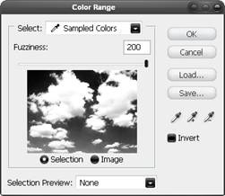
Change the blending mode to normal then go select>color range and pick the very darkest part of the image and use the settings shown below, OK.
Normal sonra seçmek git> renk yelpazesi ve görüntünün çok karanlık bir bölümünü seçmenize ve ayarları aşağıda görüldüğü gibi, Tamam kullanın karıştırma modu değiştirin.
Now you should have a rough selection around the clouds, hide this layer then select the foreground group and in the layers panel click the layer mask button at the bottom.
Şimdi, daha sonra ön grubu seçin ve katman panelini tıklayın altındaki katman maskesi düğmesi bu katmanı gizlemek bulutlar etrafında kaba bir seçim olmalıdır.
Step 22
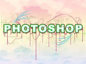
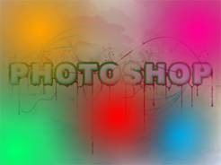
Adım 22 The last step is to add some color adjustments to the whole image.
Son adımda tüm görüntüye renk ayarlamaları eklemektir.
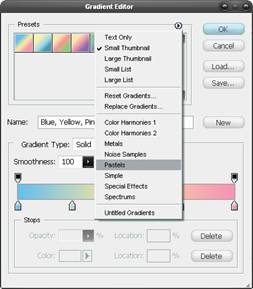
Start by creating a new layer above the foreground group then select the gradient tool and create a gradient like shown here.
Sonra gradient aracını seçin ön grup üzerinde yeni bir katman yaratmak gibi bir geçiş oluşturmak başlayın burada gösterilir.
Use a radial gradient setting an create a blurry circle, go back to the gradient editor and change the color and do this again until you have something that resembles below.
Bir radyal eğim bir, bulanık bir daire oluşturmak geri gradient editörü gidin ve renk değişikliği ve tekrar kadar Bunu yapmak ayar kullanın aşağıda benzer bir şey var.
Lastly change the opacity of this layer to 50% and the blending mode to color.
Son olarak% 50 ve renk için karıştırma modu bu katmanın matlık değiştirin.
One last adjust that I save until last is to move that cloud layer that we duplicated to the top of the layer stack, unhide it then change the blend mode to soft light; I'll let you decide on the opacity this layer should be.
Son bir o kadar son kaydetmek ayarlamak bu bulut katmanı bu katmanı üst yığına, o yumuşak ışık için uyum modunu değiştirmek göstermek çoğaltılamaz yönelmek; Bunu katman olmalı matlık karar sağlayacağız.
 Yeni bir belge oluşturun, 1024x768px boyutları ile bu süre daha sonra gradient tool (G) seçin ve Gradient Editor açın. Bu önayarlarını kutusuna oku tıklayın ve tercih pastel, bu sette ilk eğim seçin. Üst için, dik tutmak için ÜstKrkt tutarak sayfanın en altında bir doğrusal eğim sürükleyin kullanma. Son 75% Bu tabaka matlık değiştirin. Bir eğim her zaman böyle bir parça başlamak için güçlü bir şekilde ancak bir doku gerektiren yapar.
 Burada, ilk bulutlar basit bir görüntü bulma arka plan doku oluşturur, bir burada bulabilirsiniz kullanılır. Kopyalayın ve ardından bu sayfaya sığacak şekilde yeniden boyutlandırmak Bu resim yapıştırın. Ardından) ve ekran için karıştırma modunda (Ctrl + renkler ters. Şimdi arka plana tam olarak bu gibi bulutları bir görüntü ile aynı yaparak biraz daha derinlemesine ekleyebilirsiniz. Bazı kullandığınız doku bağlı olarak diğerlerinden daha iyi görünecek ne zaman Photoshop herhangi bir parça için, her zaman karıştırma modları ile deneme bir doku ekledi.


")